

An artist website does one of two jobs, and the good ones choose one and stick to it. A portfolio site is built to get you chosen by galleries, curators, journalists and collectors. Its most valuable part is the archive: the body of work, the exhibition record, the press. A store is built to take money without a conversation. Its most valuable part is the buying path, with prices, editions, framing and delivery all answered before anyone reaches a basket. The decision behind that fork is not about design. It is about whether you want to handle selling your own work or have other people do it for you. A template portfolio can cost little more than the subscription. A custom build with a real catalogue behind it runs to about €3,000 at our 2026 rates, and roughly €800 a year after that. Expect neither kind to bring you new buyers or new followers on its own. On the portfolio site we run, ninety-seven per cent of the search clicks Google could tie to a query over sixteen months were people already searching the artist’s name.
Below are thirteen working artist websites and the decision behind each one. After them are two years of analytics and sixteen months of search data from a portfolio site I designed and still run. That includes the parts that did not work.
Most people start this by finding sites they like and working backwards from the design. That skips the decision. The site you are admiring was built for somebody with a different aim. They are at another point in their career, they get paid a different way, and different people are arriving at their page. Until you know where you sit on that, the layout question has no right answer.
The two jobs a website can do for an artist
A portfolio site’s job is to hold the record and keep it current. The work, the exhibition history, the press, all in one place and all readable. It sells nothing. It gets you chosen.
A store’s job is to complete a sale without you in the room. Prices, stock, editions, framing, shipping, and a checkout at the end. It does not have to impress a curator. It has to remove every reason to stop.
Two different machines. One is built to be believed, the other is built to be bought from.
You can see it in who arrives. A curator, a journalist or a gallery director wants your record. What you have made, where it has been shown, who has written about it, and whether any of that is current. They are deciding whether to take you seriously, and they will read for ninety seconds.
A buyer wants something else. What is available, what it costs, what size it is, whether it arrives framed, and what shipping adds. They are deciding whether to spend money. Anything they cannot answer on the page is a reason to close the tab.
Both want something different at the top of the page, and a page can only lead with one.
Which of the two do you need?
Answer one question before you look at a single design. Do you want to handle selling your work yourself, or do you want other people to do it for you?
If you want to handle it yourself, you are choosing a store, and you are choosing everything that comes with it. Pricing, stock, packing, framing, shipping quotes, customs paperwork, returns, and the email you send when a courier loses something. A website does none of that. Either you run it or you pay somebody to run it, and that cost belongs in the decision.
If you want other people to sell for you, through galleries, curators, agents or commissions, you are choosing a portfolio. Your job is to be picked. The site’s job is to make picking you easy, and to make you look like someone worth the risk. Nothing on it is for sale, and that is the point.
Career stage usually pushes you one way. An artist already exhibiting and being written about is normally served better by a portfolio, because the selling is happening elsewhere. An artist building an audience from scratch, moving prints and smaller originals direct, usually needs the store. The honest version is that this is a question about how you want to spend your week, not about how far along you are.
What is a portfolio site actually for?
The instinct is to treat it as a shop window that brings people in. It is closer to the opposite. It is where people arrive once something else has done the introducing. Its job is to be complete and current by the time they get there.
Which makes the archive the point. Not the homepage, not the hero image. The archive: the full body of work, organised so someone can move through it, plus the exhibition history and the press. It is the part that compounds. A homepage looks the same in five years. An archive is worth five years more.
Here is the list I work from.
- The work loads first, at a size worth looking at
- Each piece has its own page and its own address, so it can be sent to someone
- Titles, dates, medium and dimensions are written as text a search engine can read
- It works on a phone, where most people will meet it
- The exhibition record is current and readable in the browser
- There is a press record, and it links out to the coverage
- The way to make contact reads as an enquiry, not a checkout
- There is a channel matched to how often you actually have something to say
- You own the domain and you own the site
- The design gets out of the way of the work
A note on the channel one, because it is the check I had wrong until Majella corrected me. I used to ask whether an artist had a mailing list. She does not have one, on purpose: there was no regular rhythm to feed it, Instagram carries the day to day, and the site carries the permanent record. A list with nothing to send is worse than no list. So the check is the rhythm, not the tool.
One thing you will see on store sites and should ignore here: can you buy it. That is a store check. On a portfolio site it is wrong advice, and getting that backwards is most of what goes wrong with these.
One of those matters more than the rest. The photography is the site. Layout, type and filing are all arranged around the images, and no amount of design rescues a badly shot painting. If you are spending money in one place, spend it there.
And there is a part nobody can do for you. Photograph every work properly. Name the files so you can still find them in five years. Size them for the web. Write down the title, date, medium and dimensions while you still remember them, then add where it was shown and who wrote about it. How accurate and how complete your collection looks online is decided at that step, offline, by you. We now ask what state an artist’s records are in before we quote, because that is what sets the number.
Design getting out of the way is the check artists notice and web people forget. More on it further down.
Seven portfolio sites, and what each one decided
Antony Gormley has the deepest archive here. Sculpture back to 1974, drawing back to 1981, and exhibitions listed into 2026.
The decision worth borrowing is how it is filed. Works sit under type, then permanence. Angel of the North lives at /works/sculpture/permanent/angel-of-the-north. Every piece has its own address, and the shape of that address tells you what kind of work it is before you click. His practice splits between permanent public commissions and gallery pieces, so that is the distinction that matters. The filing makes it for you.
Conrad Shawcross files by year instead. Around 150 works, each on its own page, filterable from 2001 through to 2025. You can follow twenty-four years of a practice in a few clicks.
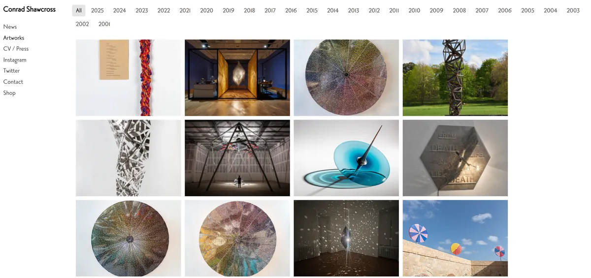
He actually files twice. The homepage sorts the same work by series name, Axioms, Continuums, Lattices and the rest, while the catalogue sorts it by year. One route for someone who knows the work, another for someone tracing how it developed. Chronology suits work that changes in visible phases, and it suits a visitor who wants to know what he was making in 2012.
Christoph Niemann files by who commissioned the work. His categories are New Yorker, New York Times, commissioned work, site-specific art, sketchbook and visual essays. The people looking are art directors, trying to picture the kind of job they are about to offer. So the site sorts itself into the shapes those jobs come in.
Same question, three different answers. Keep that in mind as the next four arrive.
Tom Hammick runs the most complete catalogue here. Roughly 500 works from 1986 to 2026, each on its own page, split by paintings, prints, monotypes, graphics and drawings.
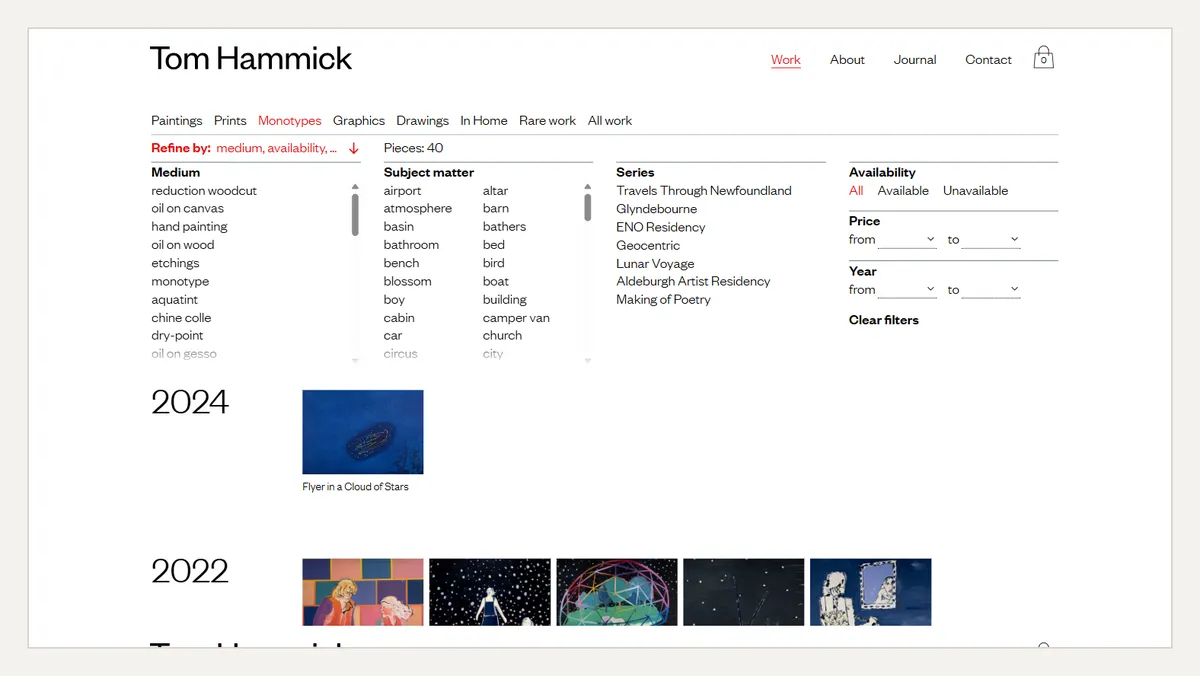
The filtering is the decision. You can narrow by medium, by subject matter, by series, by year, by price, and by whether a piece is still available. Each work also says where it stands, including when it is out on consignment, and the enquiry route is an email rather than a basket. That serves a buyer properly without turning the site into a shop, which is the hardest balance on this list to get right. We do the same on the site further down, for the same reason.
Emma Stibbon organises by subject territory: volcanoes, polar regions, tidal and edge, wild lands, cities in transition. Not by year, and not by medium. She files by the places the work comes from, which is also how the commissions and the invitations tend to arrive.
Kehinde Wiley treats the press record as a section in its own right. Roughly eighty items, each dated, each linking out to the publication that ran it, from the New York Times to Frieze. A journalist can see the coverage and reach it in one click. So can anyone deciding whether the coverage is real.
Thomas J Price builds the whole site around exhibitions rather than works. Each major public commission gets its own page, with the press attached to it. His practice is defined by where the work stands, not by what is available. So the venue is the unit, and the site is arranged that way.
One more pattern is worth knowing, though I am not going to name anyone for it. Some represented artists run a single page that routes everything outward, to their galleries’ contact details. If your galleries genuinely handle all of it, that is a real strategy, and it costs you almost nothing to run.
What is a store-first site actually for?
Its job is to finish a sale while you are asleep. That sounds obvious until you write down what has to be true for it to happen.
You are taking on the full sales cycle. Pricing, stock levels, packing materials, framing, shipping quotes, customs paperwork and returns. The website handles none of it. Either you do, or you pay somebody who does. The artists who enjoy running a store are a different group from the artists who enjoy painting, so work out which one you are before you build the thing. A courier losing a €400 print is your afternoon, not your website’s.
Photography carries more weight here than anywhere else. Nobody is standing in front of the painting. The image is the only thing conveying size, surface and colour, and a buyer who cannot tell what is arriving does not press buy.
Price on the page, or enquire?
This is the decision that tells a visitor how sales-forward your site is, and artists genuinely split on it.
A price on the page lets someone decide on their own. No email, no wait, no working up the nerve to ask what it costs. It suits prints, editions and anything with a repeatable number, and it is the only version that sells while you sleep. The trade is that your prices are public, permanent and easy to compare.
An enquiry form keeps the number off the page and starts a conversation instead. It suits originals, commissions and work where the price moves with size, framing or shipping. It also filters out people who were never going to buy. The trade is every buyer who will not send an email, and there are more of those than artists expect.
The way to choose is to ask how much of the sale you want the page to do. If you want the site selling, put the number on it. If you want the site introducing, take the enquiry and expect fewer conversations, warmer ones.
Then the rest of the checks. A buyer is making a decision with money in it, and every unanswered question is a reason to stop.
- Buying takes as few steps as possible
- Originals, limited editions and open editions are clearly separated
- The price is on the listing, not two clicks in
- Edition size is stated, and sold-out means sold-out
- Framing is answered before the basket
- Shipping cost is answered before the basket
The last two are where most of the money leaks.
Four store sites, and what each one decided
Worth saying before these four: I did not build any of the thirteen sites in this article, and I do not know what any of them were briefed to do. I am reading them from outside, the same way you would. The only build I can take you inside is further down.
Erin Hanson puts the entire ladder on one page. A single artwork page carries the original, a textured replica, canvas prints and paper prints. Each has its own price, from a $175 paper print up to a six-figure original. Frames are chosen inline.
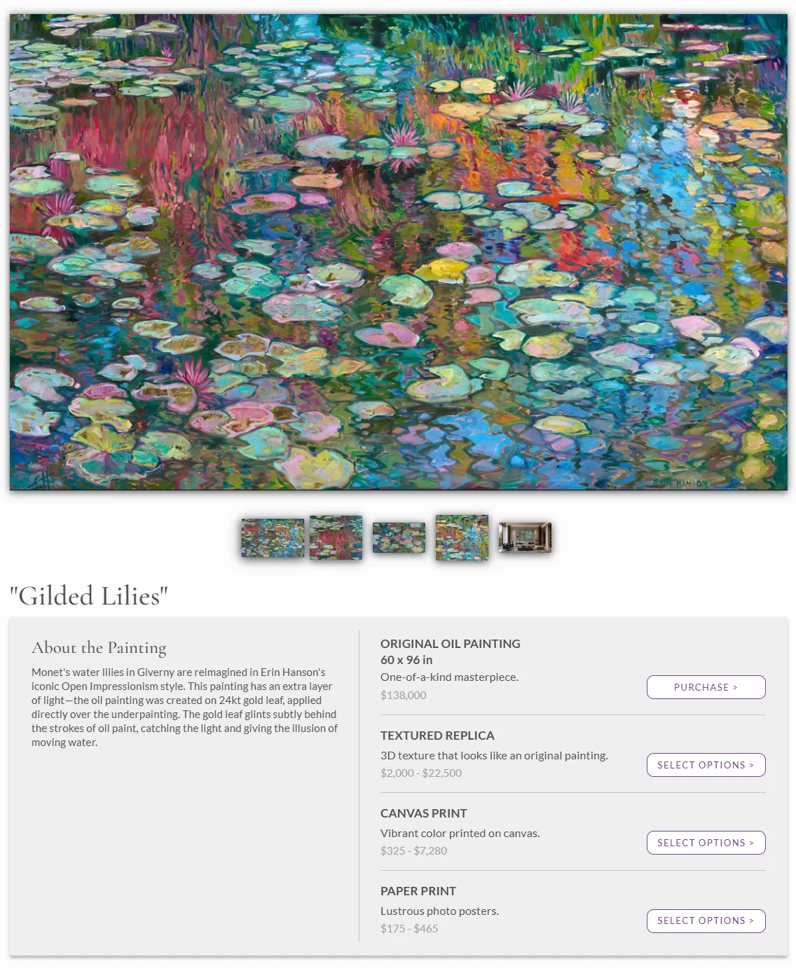
The decision is that someone who loves a painting should find the version they can afford without leaving the painting. Shipping, returns and framing are all answered on the FAQ page, with a real figure rather than a vague reassurance.
Robert E Fuller puts framing in front of the buyer at the moment it matters. Pick a print and the frame choices are there with prices on them: light oak, walnut burr, mounted, loose. Delivery sits on the same page, £4.95 in the UK and free over £75.
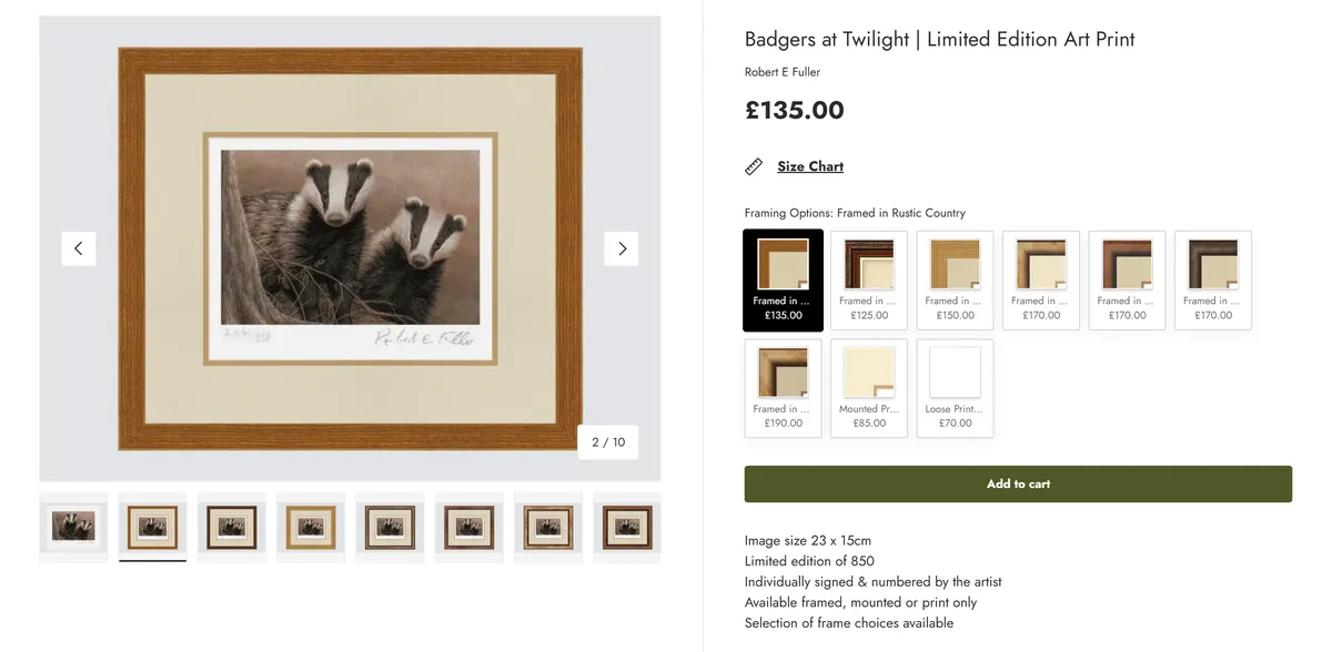
The decision is to treat the frame as part of the product rather than an extra. Someone choosing a £70 print is really deciding whether to spend £190 on something that arrives ready for the wall. Fuller lets them make that call in one place, with the real number in front of them.
Angela Harding states the edition size on the product page. A sold-out print shows as sold out, with an option to be told when it returns. Buying a numbered print is partly about scarcity, so the site treats scarcity as information rather than pressure.
Her original paintings are not sold on the site at all. They go through ten named galleries, and the site says so and links to them. Two channels, each doing what it is good at.
Sam Toft makes the current exhibition the shop. The nav runs current, previous and future exhibitions. The current one is the product listing, with framing described piece by piece and prices in the low hundreds to low thousands.
Making the exhibition the shop is the neatest answer I have seen to the portfolio-or-store question, because it is both. The rhythm that builds a reputation is the same rhythm that sells the work. The site only has to say one thing at a time.
Two more worth a look. Ashley Longshore keeps enquiry-led paintings and a real add-to-cart shop as separate parts of the site, so neither gets in the other’s way. Carne Griffiths makes the shop categories the top-level navigation, and splits originals on paper from originals on canvas. Worldwide delivery is folded into the price, so the number on the page is the number you pay.
The thirteen artist website examples at a glance
Here are all thirteen artist website examples in one place, with the filing decision that shapes each one.
| Artist | Platform | How the work is filed | Job |
|---|---|---|---|
| Antony Gormley | Custom build | By type, then permanence | Portfolio |
| Conrad Shawcross | WordPress | By year, 2001 to 2025 | Portfolio |
| Christoph Niemann | WordPress | By who commissioned it | Portfolio |
| Tom Hammick | Custom build | By medium, with a status on every work | Portfolio |
| Emma Stibbon | Artlook | By subject territory | Portfolio |
| Kehinde Wiley | WordPress | Works by title, press by date with outbound links | Portfolio |
| Thomas J Price | Squarespace | By exhibition and commission | Portfolio |
| Erin Hanson | Custom build | By painting, with every format on the one page | Store |
| Robert E Fuller | Shopify | By print, with framing priced as an option | Store |
| Angela Harding | Shopify | By print, with edition size and stock shown | Store |
| Sam Toft | WooCommerce | By exhibition, and the current show is the shop | Store |
| Ashley Longshore | Shopify | Enquiry-led paintings kept apart from the shop | Store |
| Carne Griffiths | Wix | By shop category, paper apart from canvas | Store |
Platforms were checked on each site rather than assumed. Hanson’s custom build is confirmed. Gormley’s and Hammick’s are custom in the sense that neither runs on one of the mainstream builders, but I could not identify the system behind either, so take those two as “not off the shelf” rather than as a specific answer.
Three of these run on WordPress and file the work three different ways. Three run on Shopify and sell it three different ways. The platform is not the decision, and that is the useful part of a list like this.
The site I designed for a painter
The painter here is my mother, which I should say up front. It is also why I can show you two years of decisions rather than a screenshot.
Her site went live in 2024. I did most of the design, all of the copy, the structure and every decision behind it, and a Webflow developer handled the technical implementation. I have since taken that side in-house and build the new sections myself.
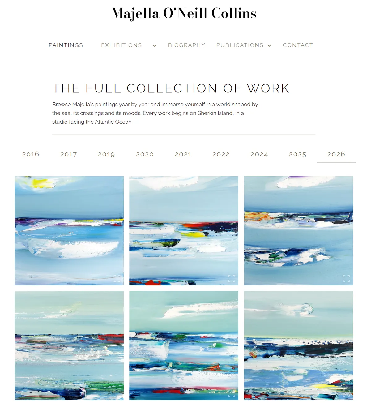
Majella asked for two things: somewhere to show the work, and somewhere to sell it. We looked at how other artists at a similar point were handling it, and concluded the two would pull against each other. She already had a profile and was exhibiting with several outlets. A shop on the front of the site would have changed what it was saying about her. So we built a portfolio: paintings, exhibitions, biography, publications split into books and press posts, contact.
We also built the shop. Then we hid it before launch and left it sitting there for two years in case we changed our minds. We deleted it in this year’s update. That was a planning mistake rather than a build one. If I knew then what I know now, after the research and a lot more websites, we would never have built it at all.
The second mistake cost more. We did not plan around a content system at the beginning. Everything on that site is data:
- Every painting, with its title, date, medium, dimensions and photograph
- Every exhibition, with its venue and dates
- Every press cutting, gathered from newspapers and broadcast
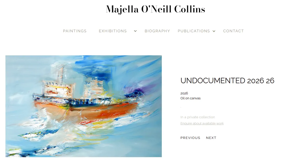
That is what the data buys you. Every painting has its own page and its own address, the title, year and medium are text rather than baked into the image, the status says where the work is, and the route out is an enquiry rather than a basket. Same call as Hammick’s, reached the same way.
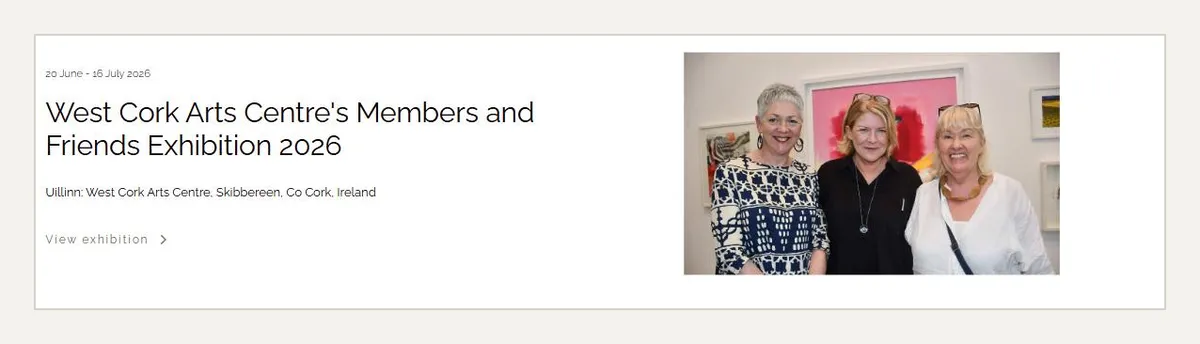
Organising that is the actual job. Doing it without the right structure underneath made the first months far slower than they needed to be. It is still where most of the annual maintenance goes.
For scale, a build of this shape at our 2026 rates:
- Around €3,000 to design and build
- Roughly €300 a year for the platform, hosting and the domain
- Around €500 a year to keep updating and improving it
Those are illustrations rather than a price list, and they are not what any one client paid. Every project like this is quoted on its own. The number is set by how much archival work is involved, and no two artists arrive with their records in the same state. If you want the wider picture, we broke down what a website costs and what moves the number in a separate guide.
Where the records existed we could tie paintings to the exhibitions they appeared in. Where they did not, no website invents them for you.
How much traffic does an artist website actually get?
Here is the part the website-builder blogs do not show you.
Take sixteen months of Search Console data. Ninety-seven per cent of the clicks Google ties to a specific query were people searching her name, or a variant of it. Everything non-branded put together is under three per cent, and the only one worth naming is “sherkin island artists”. Roughly nine in ten clicks land on the homepage.
So a deep, well-maintained, properly built portfolio site brought in almost nobody new through search in sixteen months. That is what portfolio sites do, and it is worth knowing before you judge one on its traffic.
Now the other side. The biggest day in two years was 29 March 2025, running close to thirty times a busy day and more than eighty times a quiet one. That was the evening BBC Two aired the Cork islands episode of The Emerald Isles with Ardal O’Hanlon. Over that weekend, more than eight in ten sessions came from the UK. No campaign, no ads, no SEO. A television programme, and a site that was ready when people went looking.
The broadcast pattern repeats at a smaller scale with every newspaper piece and every show. People see the work somewhere, they search her name, they land, they look through the paintings and the press, and some of them get in touch. As she puts it herself: “Within three weeks of going live, the site had already paid for itself.” The site did not sell those paintings. It gave people who had already found her a reason to trust what they saw, and an obvious way to reach her.
Can you not just market your way to traffic?
If you are selling, yes. A store has something for a visit to turn into, so the usual tools work on it. Instagram, paid ads, sponsored articles, an email list, a print drop timed to a show. You can spend at the top and count what came out at the bottom, and if the numbers work you keep going.
A portfolio site has no checkout, so there is nothing at the end for a click to become. You can still drive people to it, and it is often worth doing, but you are buying awareness. You measure it in enquiries, invitations and shows rather than in sales. It also moves slowly enough that you will rarely point at the ad that caused it. That is branding rather than selling. Know the difference before you put a budget behind a portfolio site and expect it to behave like a shop.
A portfolio site is not a discovery engine. It converts attention you have earned somewhere else, and if nothing is feeding it, it will sit there looking lovely.
What I do differently now
Two things.
I put the portfolio-or-store question first, as its own step, before anything gets designed. I ask who is going to handle the selling, and I ask it in the first conversation. Not three weeks in, which is where we arrived at it on Majella’s site. It is the decision everything else hangs off, and we got to the right answer by a slower route than we needed.
And I settle the design against the work before designing anything. We went through a phase of testing colour, type and movement, and I came out of it with two rules I have not broken since. I keep movement off the artwork: animation looked good on its own and pulled the eye away from the art every time. And I treat the palette as framing rather than branding, so I now choose it against the artist’s actual paintings before I open a design file.
If you are looking at a site for inspiration, start there instead. Not with which one looks best, but with which one is doing the job you need doing. Then look at what it costs to build one properly.
Frequently asked questions
Is it worth having a website as an artist?
Yes, but not for the reason most people expect. It will not find you an audience on its own. It is where people land after they hear about you somewhere else, and it decides whether that moment turns into an enquiry or nothing. On the site we run, the biggest day in two years came from a television broadcast, not from search.
What website platform is best for artists?
The thirteen sites in this article run on Squarespace, WordPress, WooCommerce, Shopify, Wix, Artlook and custom builds, and all of them work. The platform is not what makes them good. Pick on two things: whether you need to take payments, and who is going to keep it up to date. If that person is you, choose the one you will actually log into.
How much does an artist website cost?
A simple portfolio on a template starts low, sometimes at the cost of the subscription. A custom build with a proper catalogue behind it is a different job, because the cost sits in organising the work rather than in the design. At our 2026 rates a build of that shape runs to around €3,000, and roughly €800 a year to keep running. Every project is quoted on its own, so treat that as an illustration rather than a price.
Should an artist sell work directly from their own website?
Ask a simpler question first: do you want to handle selling yourself, or do you want other people to do it for you? Selling yourself means a store, and it means owning the whole job behind it: pricing, stock, packing, framing, shipping and returns. Having others sell for you means a portfolio, where the site's job is to get you chosen rather than to take money. Trying to do both at once usually weakens each, because the top of the page can only lead with one.
What should an artist website include?
Photography first. The images of the work are the site, and everything else is arranged around them. No layout rescues a badly shot painting, and no buyer or curator gets past one. After that: a page per piece with title, date, medium and dimensions written as text, an about page, and a clear way to make contact. For a portfolio site, add a current exhibition record and a press record. For a store, add prices or an enquiry route, edition sizes, and shipping and framing answered before the basket.
How do artists get traffic to their website?
Almost entirely from somewhere else. On the site we run, ninety-seven per cent of the search clicks Google ties to a specific query over sixteen months were people searching the artist's name. Exhibitions, press, broadcast and Instagram create the interest, and the website converts it. A store can also buy traffic, because there is a checkout at the end to measure against. A portfolio site cannot in the same way, because there is nothing for a click to turn into.